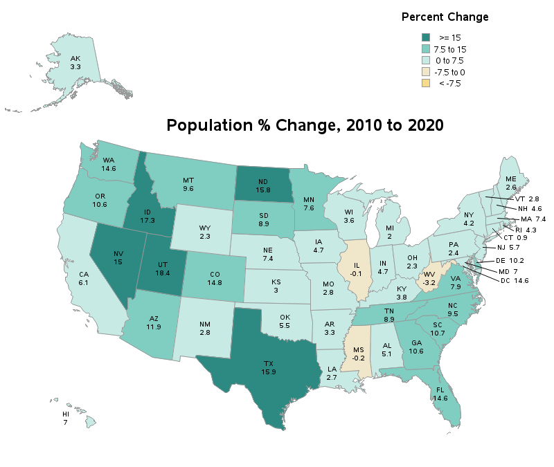
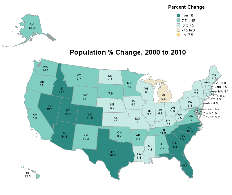
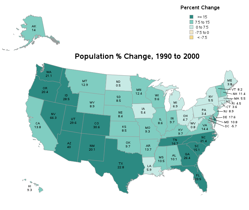
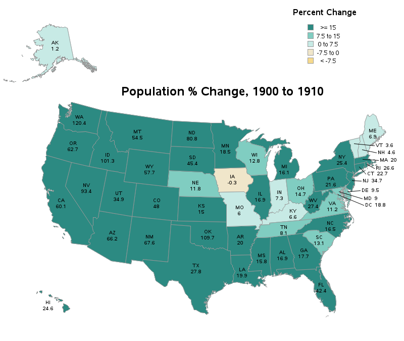
With the 2020 Census numbers starting to come out, it's interesting to look at what states are gaining (or losing) people. In this example, I create a custom map similar to the ones the US Census Bureau likes to use, and plot the 10-year change in population.
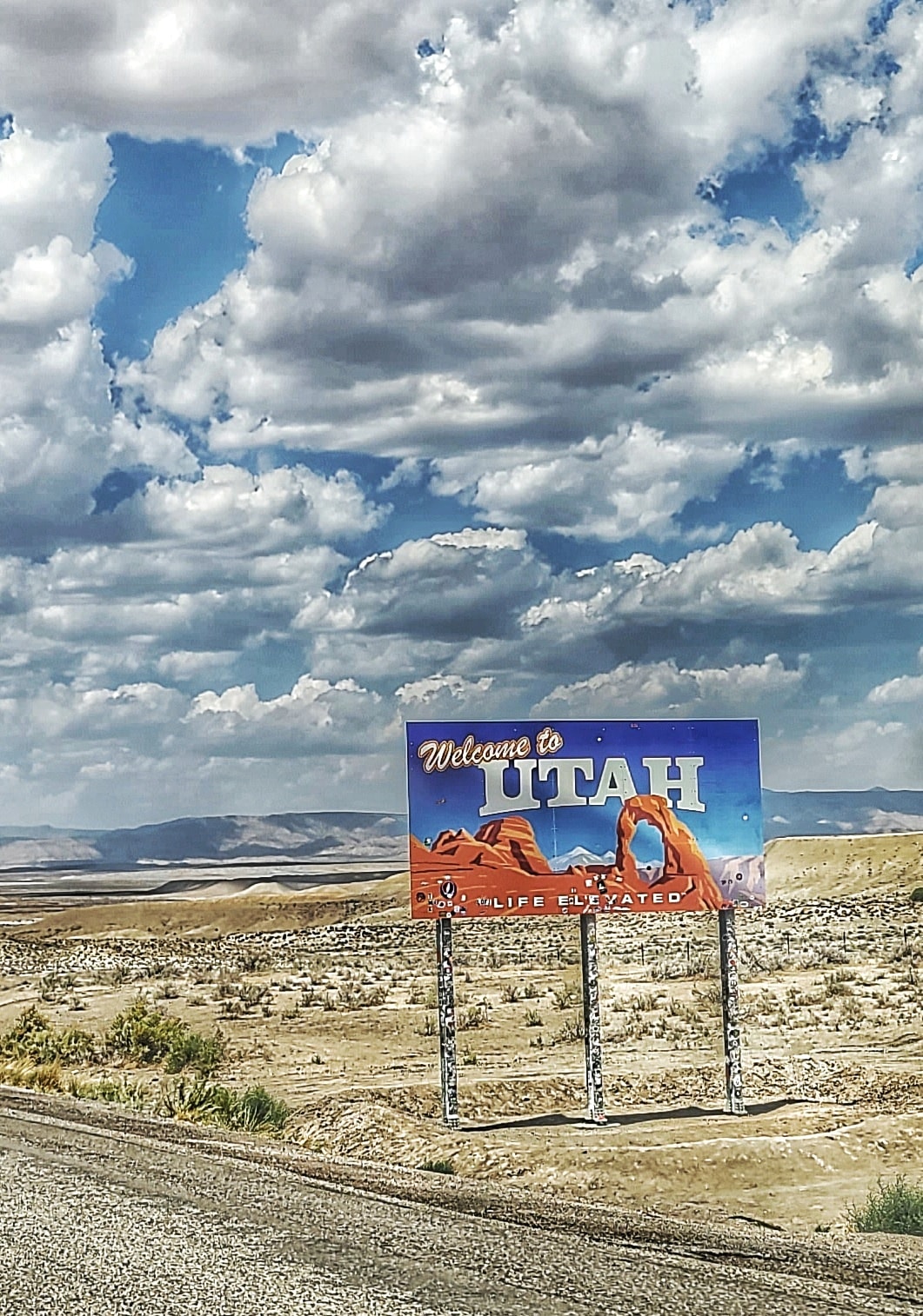
But before we get started, here's a "random" picture to get you into the right frame of mind ... This is a photo my friend Eva took (I think she's got "welcome to" pictures for just about every state!)
The Data
When you license SAS/Graph, you get a sashelp.us_data dataset that contains several useful data values for each state. Included is a set of variables that contain the % change in population for each decade. The variable named change_2010 contains the % change between the 2000 and 2010 census, and so on. Since the 2020 Census was only recently released, we haven't shipped the change_2020 data yet - but it's in the pipeline!
The Map
Traditionally, when creating a map to plot data (rather than a map for geospatial work such as navigation) many map-makers move and resize the remote states closer to the main ones, so that they better fit onto a page without wasting too much space. For the US, one technique is to project/resize/move Alaska and Hawaii separately, so they appear in the bottom/left corner of the map. We ship a special SAS map arranged like that, called mapsgfk.us.
The Census Bureau likes to make their map a little more geospatially correct, by placing Alaska at the top/left, since that's more representative of where Alaska is actually located. Therefore I decided to create a custom map like that, and I'll share it with you here. Note that it's a little tricky, because you have to project/resize/move Alaska, Hawaii, and the rest of the US states separately, and then combine them. And to make it even trickier, I'm placing the labels based on latitude/longitude positions, and you must also project/resize/move them the same as the map areas, so they'll line up properly.
The Results
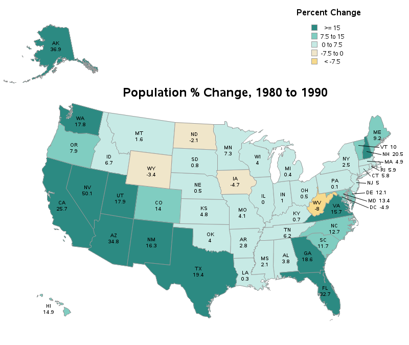
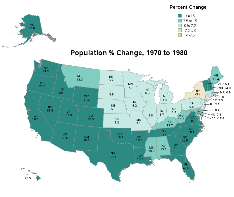
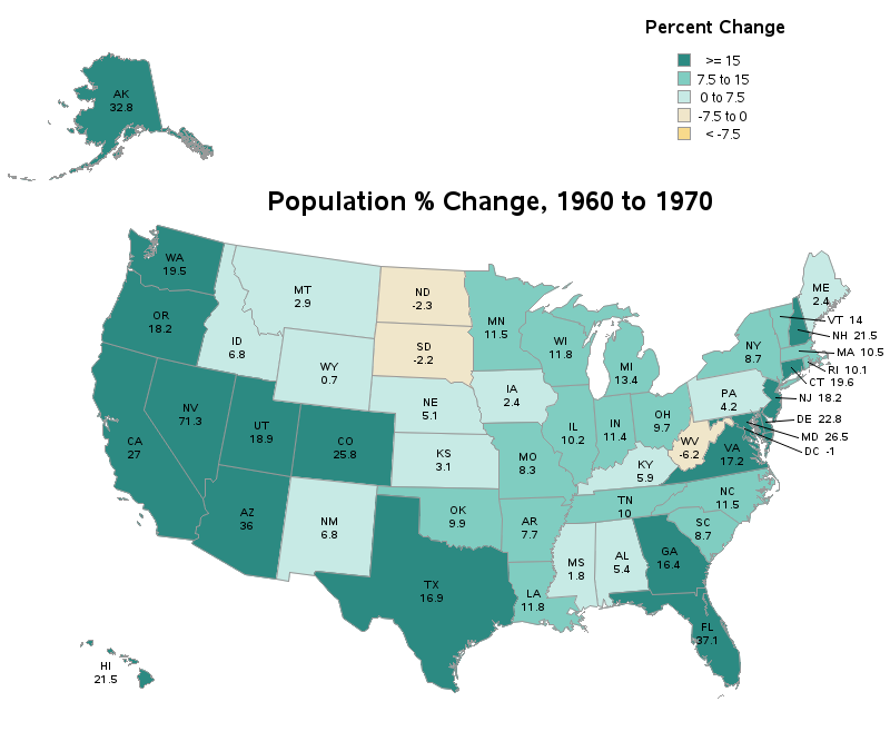
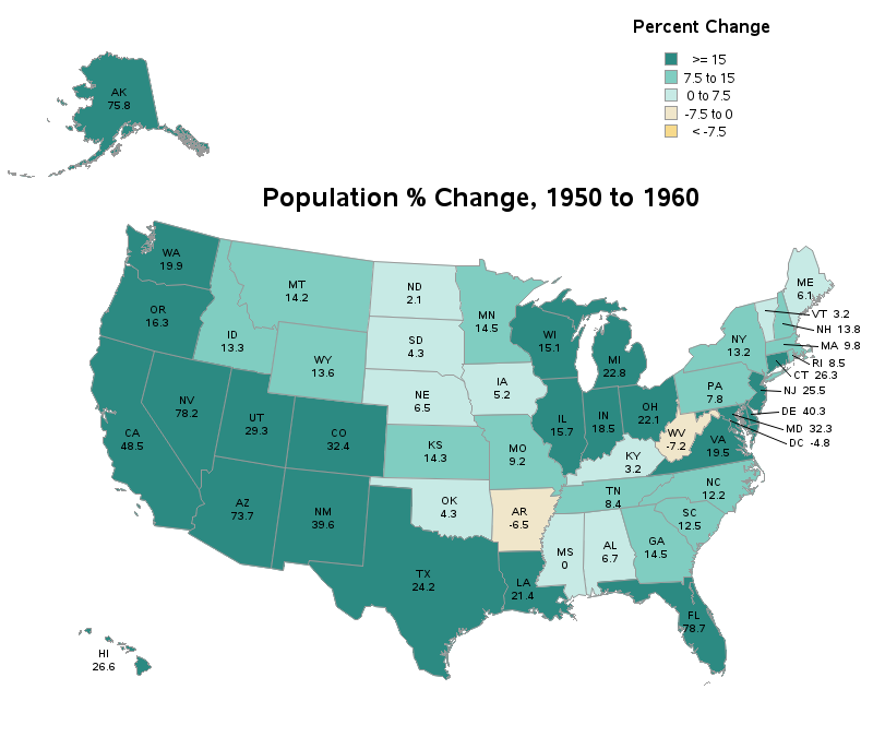
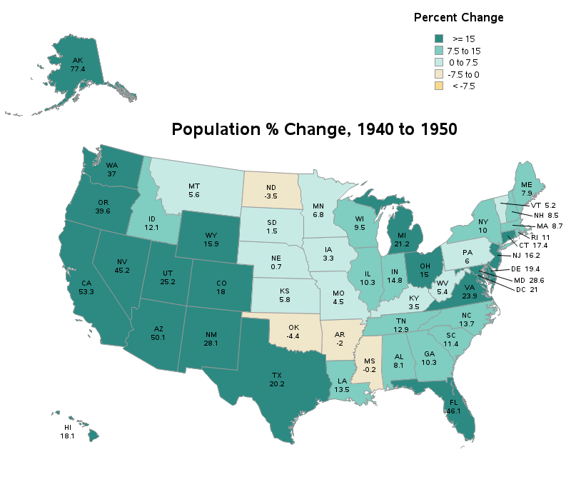
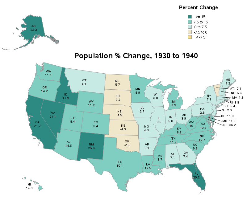
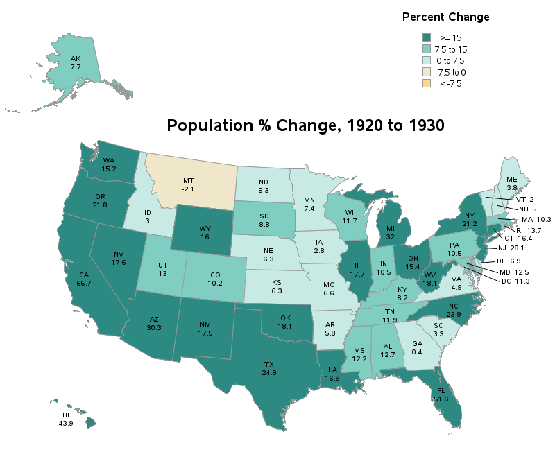
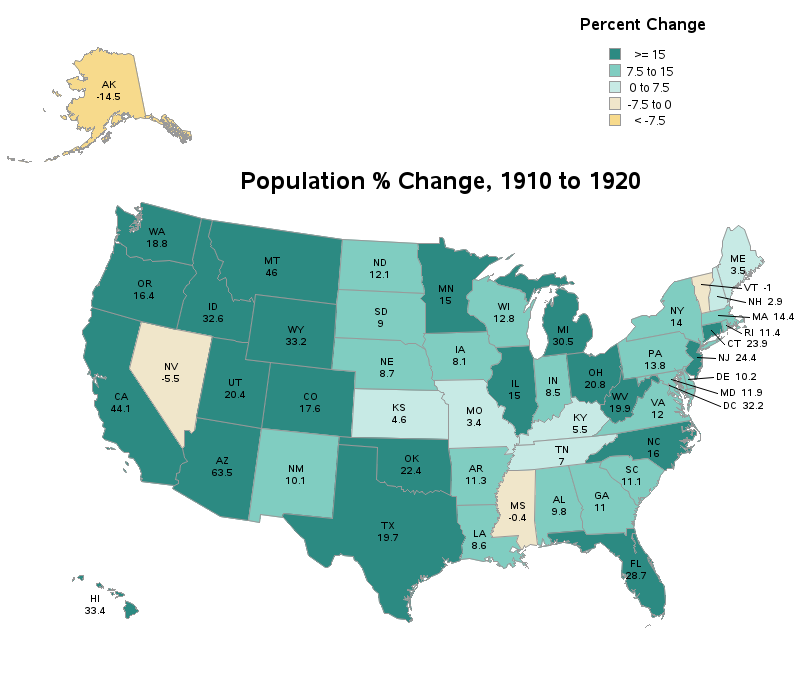
Here are maps for all the decades since year 1900. Do you have any special insight that might explain some of the population shifts? Please share in the comments (especially if it's something most people wouldn't think of!)


3 Comments
Thanks for this example! It's close to what I need to do for work.
Enjoy your retirement!
Excellent! 🙂
Robert
I found this nice graph on twitter. I think you may like it. https://twitter.com/erindataviz/status/1489009794245541888?s=21
Jean-Louis